
Brand Proposal
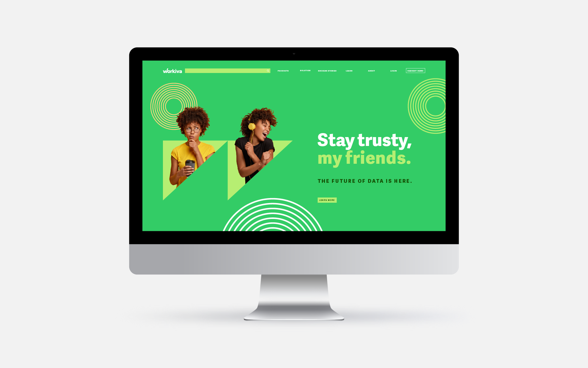
This project is an overhaul of the brand voice and tone for Workiva. The general goal was to make the brand more approachable, bold, and clean. The first thing I worked on was the color palette. I wanted the colors to pop on screen but not be too jarring. Next, I tried to think of ways to make the brand more humanistic and friendly. Originally, Workiva didn’t have many photos of people in their brand because stock photography can look cheesy and lazy. To combat that, I put color overlays on our photography to create consistency and hide the “stock image look”. Another graphic element I wanted to implement was the triangle from the original logo as well as circles to combat and complement the angular shapes. Especially in the case of the homepage, I wanted to use triangles and images to show the positive user journey of working with the Workiva Platform.
Homepage
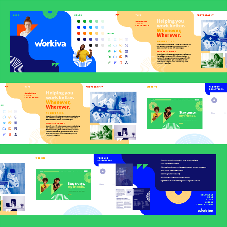
Customer facing product collateral spread: Front & Back
Customer facing product collateral spread: Middle spread